Land of Confusion
Land of Confusion ist eine Posterarbeit zum Thema "disconnection" und wurde im Rahmen eines Kreativwettbewerbes in einer Gruppenausstellung des spanischen Designstudios Flaco (jetzt "Brutto") gezeigt. Was bedeutet "disconnection" in Zeiten von Lockdowns und Quarantänen?
Land of Confusion is a poster design on the subject of “disconnection” in times of lockdowns and quarantine. In the context of a design contest, it was chosen to be displayed in a group exhibition online and in-house at Flaco Studio in Spain.
Tasks // Poster Design / Illustration
For // Flaco Studio (now Brutto) // 20/05/202 - 30/09/2020 online // 18.07.2020 - 11.07.2020 in-house
Die Arbeit "Land of Confusion" setzt sich grafisch auf abstrakte Art und Weise mit dem Thema "disconnection" auseinander und bezieht sich auf einen bekannten Song der 80er Jahre, der überraschend gut zur Situation passt. Was genau es mit dem Poster auf sich hat, verrät der Originalbeitrag:
Staying home. Keeping distance. Checking news.
Sometimes these uncertain days, disconnection feels like a land of confusion - or rather like a world of confusion. This poster refers to a surprisingly fitting song by Genesis, with a message more relevant than ever now. The "Land Of Confusion" of the 1980's led to a design that checks the news channel for the most important information, keeps distance and physically disconnects to connect again. That uses disconnection as a chance to find inspiration in new things and new perspectives in familiar things - like that one song stuck in our head.
As Phil Collins said: This is the world we live in // and these are the hands we're given // use them and let's start trying // to make it a place worth living in.
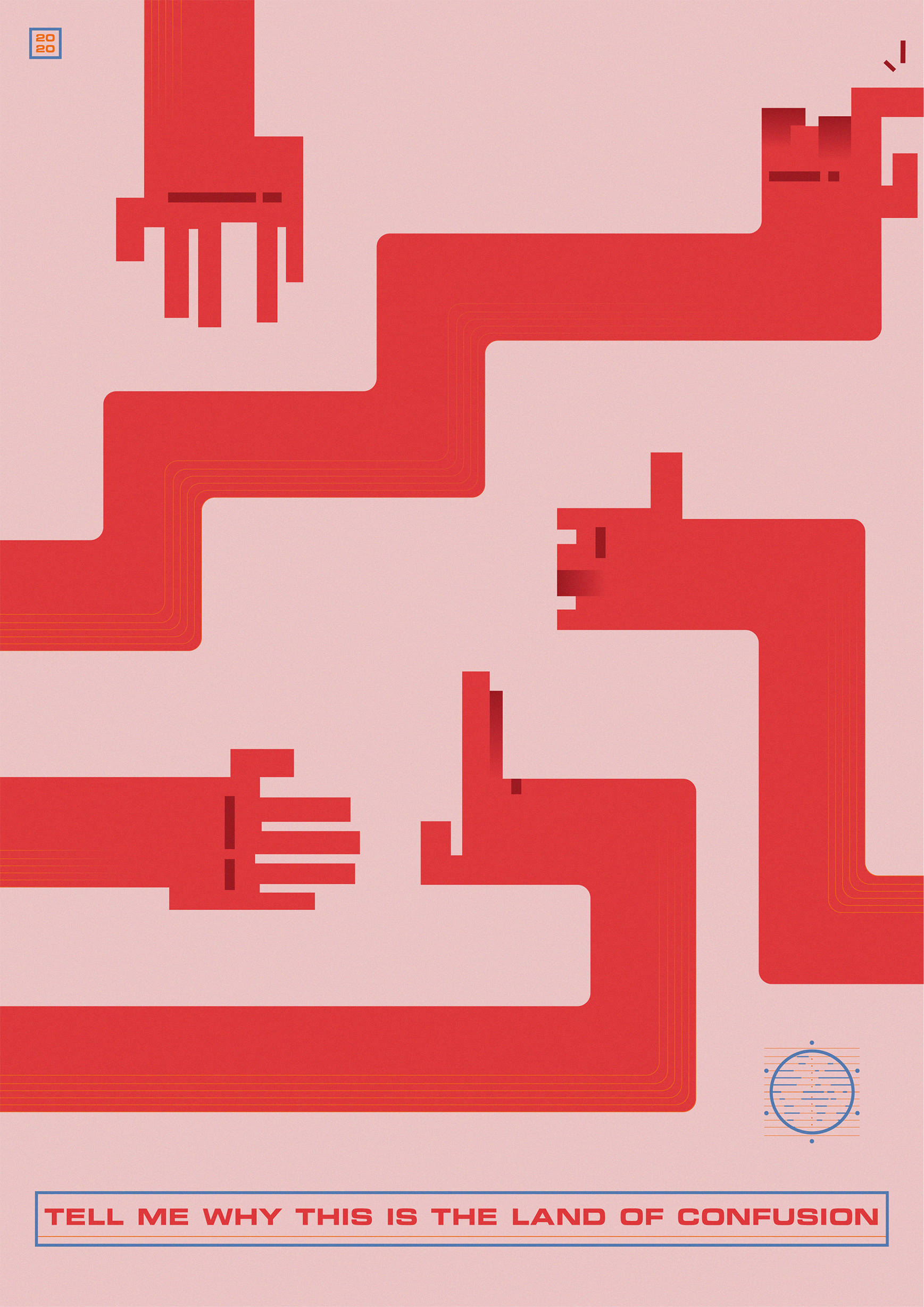
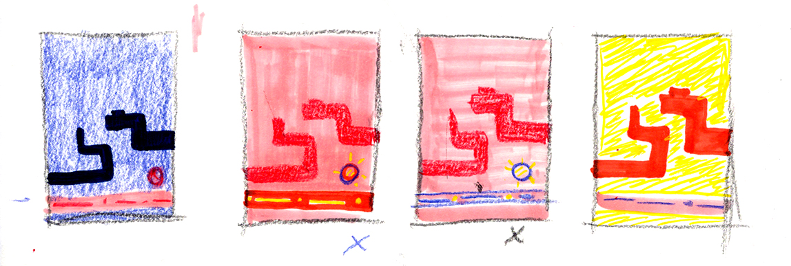
Land of Confusion arbeitet mit Händen, die sich nicht berühren dürfen, die Abstand halten und manchmal nicht genau wissen, was sie tun sollen - sich dennoch begrüßen und eine Verbindung herstellen, in anderer Form. Eine News-Channel-Metaphorik inklusive Live Ticker und Logo informiert uns ständig über die aktuellen Entwicklungen der Pandemie - in den verschiedensten Medien weltweit.
Warnende Rot-/Rosa-Töne bestimmen die Komposition, die direkt mit Hinweisen zum wütenden Virus in Verbindung gebracht werden können. Das neutrale Blau in Kombination mit orangenen Akzenten steht für informierende, seriöse Nachrichten-Kanäle.
The design focuses on hands keeping distance, not touching anyone or anything - and not always knowing what to do. Still, they welcome each other and connect in different ways. A live ticker and TV channel logos refer metaphorically to news channels around the world constantly providing information on the current stage of the pandemic. Red and pink colours refer to the dangerous virus while blue and orange highlight reliable news channels and scientific work.